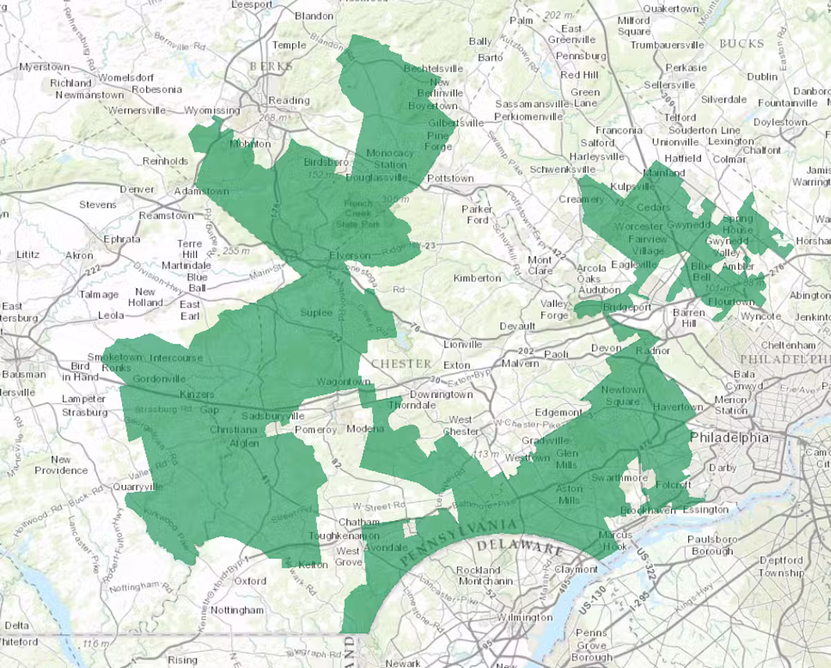
Every ten years, after the Census Bureau releases its population counts, something remarkable happens across America. State legislatures and independent commissions gather in backrooms (and sometimes courtrooms) to redraw the boundaries of congressional districts. On the surface, this seems straightforward: boundaries should reflect communities, ensure equal representation, and abide by the principle of “one person, one vote.”
But there is a hidden math problem underneath. And for centuries, politicians have been solving it in their favor.
Welcome to the world of gerrymanderingthe art (and increasingly, the science) of manipulating district boundaries to engineer electoral outcomes.
What Is Gerrymandering, Really?
At its core, gerrymandering is the practice of drawing district boundaries to give one political party or group an unfair advantage. The term dates back to 1812, when Massachusetts Governor Elbridge Gerry approved a state senate district shaped so oddly that a newspaper cartoonist drew it as a salamanderGerry-mander was born.
But here is what makes gerrymandering so mathematically interesting: it is not just about cheating. It is about optimization. And as it turns out, optimizing for political advantage is a genuinely hard math problemone that computers have gotten very, very good at solving.
The Two Classic Strategies: Pack and Crack
Before we get to the math, we need to understand the strategies. There are two fundamental ways to manipulate a map:
Packing involves concentrating opposition voters into as few districts as possible, letting you win those by huge margins but losing narrowly everywhere else. Think of it as packing all the opposition supporters into a few wasteful wins.
Cracking does the opposite: you split opposition voters across multiple districts, diluting their voting power so they cannot form a majority anywhere. They win nowhere, even though their total votes might be substantial.
Both strategies rely on knowing exactly where voters liveand that is where the math gets sophisticated.
The Efficiency Gap: Measuring Wasted Votes
For decades, courts and reformers struggled to quantify gerrymandering. Then, in 2015, mathematicians Nicholas Stephanopoulos and Eric McGhee published a paper introducing a deceptively simple metric: the efficiency gap.
Here is how it works: count the wasted votes in each district. A wasted vote is either:
1. A vote for a losing candidate, or
2. A vote for a winning candidate beyond what they needed to win (any votes past 50% + 1)
Add up all wasted votes for each party, find the difference, and divide by the total number of votes. That is your efficiency gap.
If Party A wastes 40,000 votes while Party B wastes 60,000, and total votes are 500,000, the efficiency gap is (60,000 – 40,000) / 500,000 = 4%.
In 2019, the Supreme Court considered this metric (though it ultimately punted on the case). A 7% efficiency gap is generally considered the threshold where courts start taking gerrymandering claims seriously.
Seat-Vote Curves: The Visual Story
One of the most powerful tools for understanding gerrymandering is the seat-vote curve. This graph shows the relationship between a party share of the vote and their share of seats.
In a fair system, the relationship should be roughly proportionala party winning 55% of votes should get roughly 55% of seats. The line is diagonal.
But gerrymandering bends that line. When you crack opposition voters, you can win a majority of seats with far less than 50% of the vote. The curve becomes steep. Conversely, packing opposition voters creates a shallow curve where the minority party wins far more seats than their vote share would suggest.
Real-world data from the 2022 midterm elections showed this clearly: in Wisconsin, Democrats won only 46% of votes but secured 36% of Assembly seats. In North Carolina, Republicans won 54% of votes but took 59% of seats. These are not anomalysthey are the fingerprints of optimized maps.
Detecting Gerrymandering: The Math Tools
Modern gerrymandering detection relies on several sophisticated mathematical approaches:
1. Monte Carlo Simulations
This is perhaps the most powerful tool in the anti-gerrymandering arsenal. The idea is elegant: generate thousands (or millions) of alternative districting maps using computers, then compare the actual map to this ensemble.
Here is how it works: a computer algorithm uses geographic and demographic data to randomly draw district boundariesbut with constraints. The algorithm must create districts of equal population, maintain geographic contiguity, and sometimes respect existing political boundaries (like counties).
After generating thousands of valid maps, you can ask: How did the actual map perform for each party compared to this random ensemble?
If the actual map gives one party 10% more seats than average across the simulated maps, that is strong evidence of intentional manipulation. Courts have started accepting this evidencePennsylvanias Supreme Court cited Monte Carlo analysis in ordering a map redraw in 2018.
2. Mean-Median Difference
This metric compares a party median vote share to their mean vote share across all districts. In a fairly drawn map, these should be close. But when a party is packed into a few districts, their median drops below their meanmeaning their votes are concentrated in a few places rather than distributed evenly.
3. Declination and Partisan Bias
More technical metrics exist (declination, partisan bias at 50% vote share), but they all try to answer the same question: Does this map systematically favor one party beyond what their vote share would justify?
The Algorithm Arms Race
Herein lies the uncomfortable truth: the same mathematical techniques used to detect gerrymandering were first developed to commit it.
In the 1980s, political operatives started using mainframe computers to optimize maps. By the 2000s, sophisticated software could generate thousands of candidate maps in seconds, scoring each one on how well it protected the incumbent party seats.
Modern gerrymandering algorithms can:
- Account for exact voter addresses and demographic shifts
- Model individual precincts voting patterns
- Run millions of simulations overnight to find the optimal map
- Even account for potential future voter migration
The math has gotten so good that some scholars argue any district map is likely partisan to some degreethe question is how much and whether it is intentional.
Court Cases and the Legal Landscape
The battle over gerrymandering has moved firmly into courtrooms:
- Rucho v. Common Cause (2019): The Supreme Court ruled 5-4 that federal courts cannot hear partisan gerrymandering claims, declaring the issue political and beyond judicial review. This was a major setback for reformers.
- Gill v. Whitford (2018): A Wisconsin case that established the efficiency gap as legitimate legal evidence, though the Court ultimately sent it back on standing grounds.
- Various state courts: Since the federal door closed, litigants have turned to state constitutions. Pennsylvania, North Carolina, and Michigan have all seen significant map changes ordered by state courts.
The Path Forward: Mathematical Solutions to Mathematical Problems
Given that gerrymandering is fundamentally a math problem, many reformers believe the solution must also be mathematical:
Independent redistricting commissionslike those in California, Arizona, and Michiganremove the incentive for legislators to draw maps in their own favor, though they are not immune to political bias.
Algorithmic districtingsome researchers propose having computers draw maps according to explicit fairness criteria, removing human discretion entirely.
Multipartisan commissionsrequiring balance between parties in the map-drawing process.
Explicit mathematical criteriasome states have codified specific metrics (like efficiency gap thresholds) into law.
The Bottom Line
Gerrymandering is not going anywhere. As long as humans draw mapsand as long as computers can optimize those mapspoliticians will try to gain advantage. But the mathematics of detection has never been stronger.
The efficiency gap, Monte Carlo simulations, and seat-vote curves give us tools to measure what our eyes might miss. Courts may be reluctant to intervene, but the data speaks for itself: in a well-drawn democracy, your vote should be worth roughly the same regardless of where you live.
The math proves it. Now it is up to us to do something about it.
Photo by Edmond Dantès on Pexels
Leave a Reply